How to use the paint color contrast checker
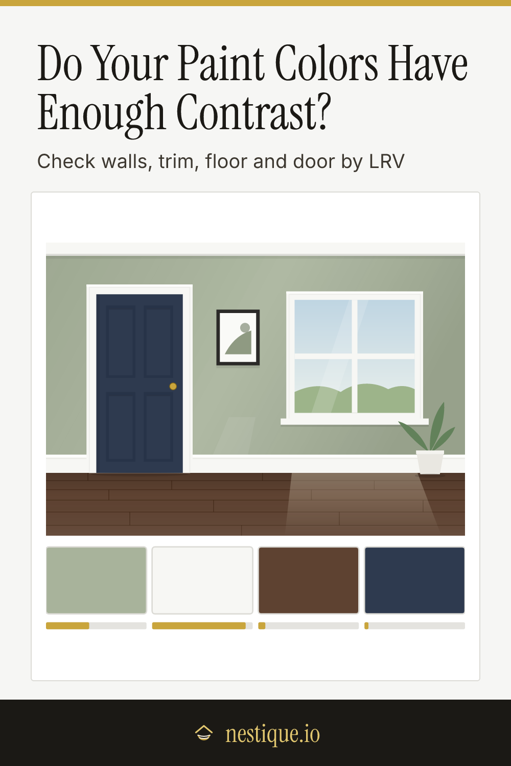
Start at the top by choosing how much of the room to check: walls and trim only, walls and trim plus the floor, or the whole set with the door. Surfaces you leave out still appear in the picture, in a quiet neutral, so the room looks finished.
Then pick a color for each surface. Tap a surface in the picture or its tab under the picture, and choose a swatch. If you already have a color in mind, type its hex code or use the color picker. Floors come in wood and tile finishes, and doors can be painted or stained.
The result shows one pair at a time, starting with walls against trim. You get both LRV numbers, the difference between them, a verdict of low, balanced or strong contrast, and the reason. The low-vision checks below it test the floor and the door against the walls.
Under the result, the grid compares every pair at once. Above the diagonal is the LRV difference and below it the contrast ratio. Tap any square to bring that pair into the result. Save the room as an image to take to the paint store, and copy the hex codes from the list beside the tool.
The rules behind the contrast verdicts
LRV measures how light a color is. Light reflectance value runs from 0 for black to 100 for white. It ignores hue, which is the point: two colors with very different hues can have the same LRV and blur together, especially in low light or for anyone with poor eyesight. Paint makers measure LRV on real samples. This checker estimates it from the screen color, which usually lands within a few points of the published figure.
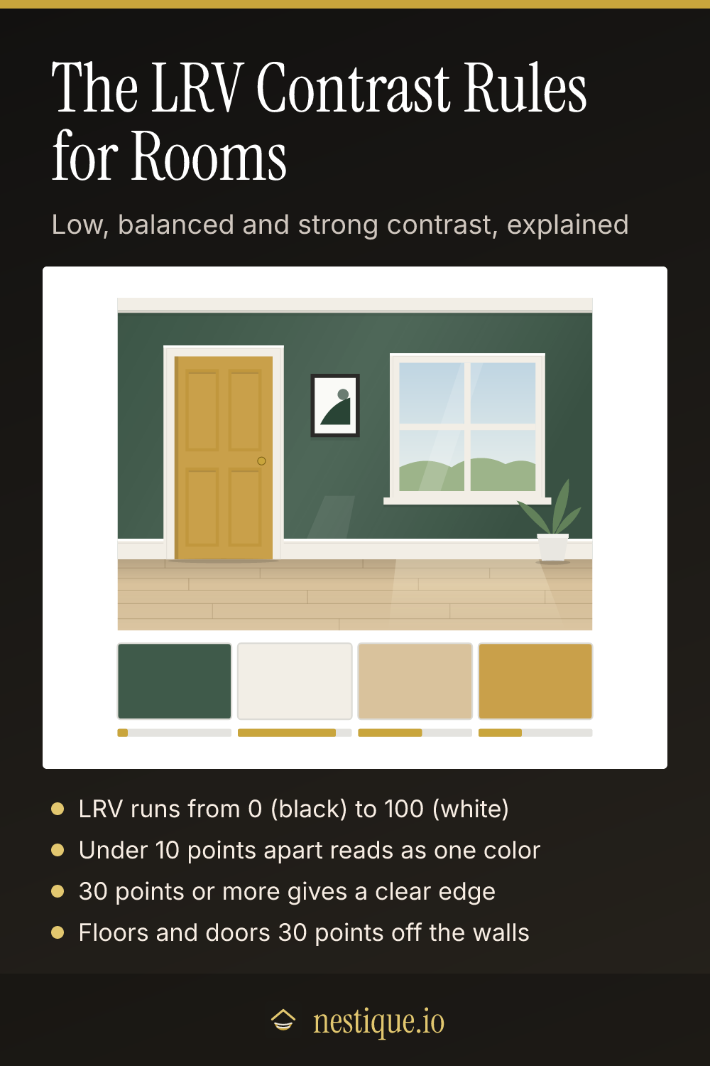
Under 10 points reads as one value. Two surfaces this close look the same lightness from across the room. That is what you want for a tonal, color-drenched room, where trim and walls are the same color or nearly so.
10 to 29 points is balanced. The difference shows up close, but there is no hard line between the two. It suits soft, layered schemes.
30 points or more is strong contrast. This is the figure in BS 8300, the UK code of practice for accessible buildings, for surfaces that need to stand apart: floors against walls, and doors against the walls around them. It also reads as a crisp edge to everyone else.
A contrasting frame counts for the door. If the door is the same color as the walls but its trim is 30 points off, the frame still marks the opening. The door check passes in that case and says so.
WCAG ratios answer a different question. The contrast ratio comes from the web accessibility guidelines, which were written for text on screens. It is shown for reference, with 3:1 as the bar for large shapes. It is much stricter with light colors, so white trim on a light wall can be strong by LRV and still well under 3:1.
Assumptions
LRV is worked out from each color’s sRGB value as relative luminance times 100, the same measurement paint makers use. Screens, paint sheen and real daylight all shift how a color looks, so treat every number as an estimate. Before you buy, check the LRV printed on the chip and look at the chips in your own room, morning and evening.
Wood floors and stained doors are rated by their average color. Grain, knots and the gaps between boards make a real floor read a touch darker and busier than one flat color. Tile is rated by the tile color, not the grout.
The verdicts compare lightness only. Two colors with a strong LRV difference can still clash. For which colors go together, start with a palette tool and use this checker to fine-tune how light or dark each one should be.
Worked example
Say the walls are a greige with an LRV of 44 and the trim is a warm white at 86. The floor is natural oak and the door is painted the wall color.
- Walls against trim: 86 minus 44 is 42 points, so strong contrast. The trim outlines the doors and windows clearly. The WCAG ratio is only 1.8:1, because the ratio is strict with light colors. That is fine for walls and trim.
- Walls against floor: natural oak estimates at 33, just 11 points from the walls. Balanced, but short of 30, so the floor check fails. The edge of the room is harder to see in dim light.
- Walls against door: the same color, 0 points. On its own that would fail, but the warm white trim around it is 42 points off the walls, so the door check passes.
To fix the floor without repainting, look at darker floor finishes. A walnut floor estimates at 7, which puts it 37 points from the walls, and both low-vision checks pass. A dark rug or a darker baseboard helps when the floor itself has to stay.
Pin it for later
Paint Color Contrast Checker FAQ
What is LRV in paint?
Light reflectance value: how much light a color reflects, on a scale from 0 for black to 100 for white. Most paint makers print it on the chip or in the color details. Colors under about 20 read dark, and colors over about 50 read light.
How much LRV difference is good contrast?
A difference of 30 points or more reads as clear contrast, and it is the figure UK accessible-design guidance uses for surfaces such as doors against walls. Between 10 and 30 points reads as a soft, layered difference. Under 10 points, two colors look like the same value from across the room.
Should trim be lighter or darker than walls?
Either works, as long as the choice is clear. Crisp white trim against mid-tone walls gives 30 points or more of contrast and outlines the room. Trim within 10 points of the wall color, or the same color, gives a calm, tonal look. The in-between range is the one that can look accidental.
Why does my floor need to contrast with the walls?
For people with low vision, a clear change in lightness where the floor meets the wall shows the size of the room and where to walk. A floor within a few points of the walls makes the edges disappear. A contrasting baseboard helps when you cannot change the floor.
Is LRV the same as a WCAG contrast ratio?
They come from the same measurement but answer different questions. LRV difference is the interior-design measure for large surfaces. The WCAG ratio was written for text on screens and is strict with light colors, so white trim on a light wall can show strong LRV contrast but a low ratio.