How to use the kitchen cabinet color visualizer
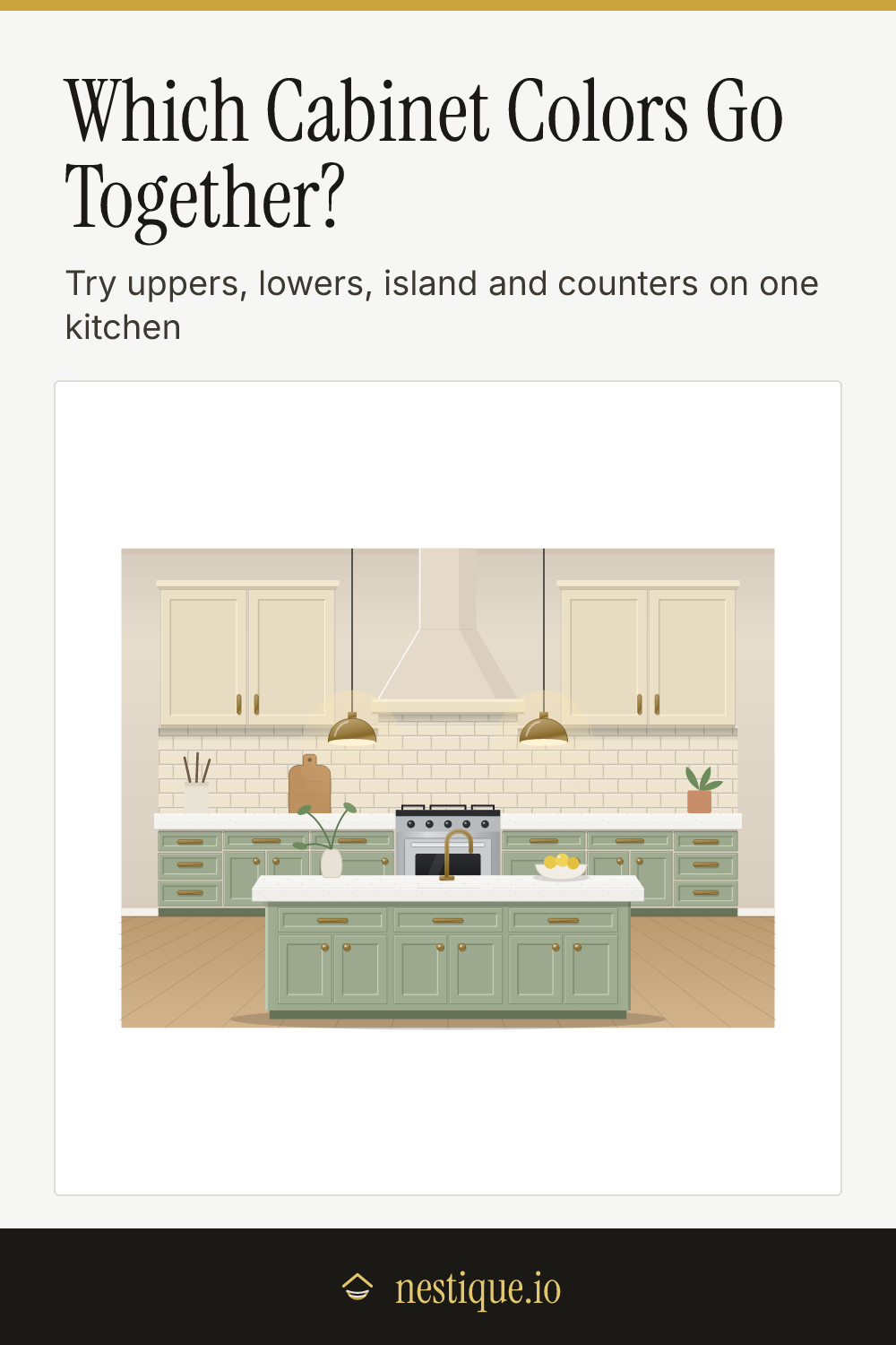
The quickest start is a preset. Tap one of the looks along the top, such as Navy & Brass or Two-Tone Sage, and the whole kitchen changes at once.
Then make it yours, one part at a time:
- Tap a part of the kitchen picture, or pick it from the buttons under it: uppers, lowers, island, countertop, backsplash, hardware or wall.
- Tap a swatch. The picture updates straight away.
- Read the panel under the swatches. It names the look, says whether the combination is balanced, and lists what works and what to check.
On a phone the picture stays at the top of the screen while you scroll through swatches, so you always see the change. The table under the tool shows how light each surface reads. When you like it, save the kitchen as an image to show your contractor or take to the paint store.
The rules behind the hints
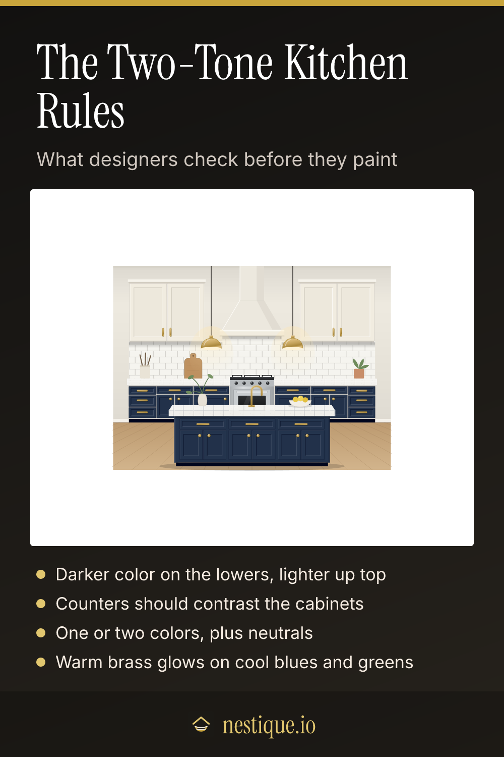
Light over dark. When the upper and lower cabinets are different colors, the darker one usually goes low. Dark lowers ground the room and hide scuffs; light uppers keep the room bright at eye level. The visualizer calls it top-heavy when the uppers are clearly darker than the lowers.
The counter needs contrast. If the countertop and the cabinets under it have nearly the same LRV, the edge of the counter disappears. A difference of 30 points reads clearly from across the room, and under 10 points the two read as one block. White on white and dark on dark are deliberate looks, so those get a note rather than a warning.
One or two colors, plus neutrals. Whites, grays, blacks and wood tones are neutrals. Most kitchens look calm with one or two real colors on top of them. Three or more start to compete.
Hardware sets the mood. Warm metals such as brass glow against cool blues and greens. Hardware close to the cabinet color disappears, which is a quiet, minimal look.
Woods should differ on purpose. Two different wood tones work when one is clearly lighter than the other and both share a warm or cool undertone.
Assumptions
The kitchen is a drawing, not a photo. Colors are flat paint colors with simple shading, and textured surfaces (wood grain, marble veining, quartz flecks) are simplified patterns. The floor, range and decor stay the same.
Swatch names are generic descriptions, not paint brands. LRV is estimated from the on-screen color; real paint chips list their own LRV, which can differ by a few points. Your screen, the paint finish and the light in your kitchen will all change how colors look, so test real samples before you buy.
Worked example
Start with the Navy & Brass preset: Warm White uppers, Navy lowers and island, a White Quartz counter, a White Subway backsplash and Brushed Brass hardware.
- The uppers have an LRV of about 84 and the lowers about 3, so the visualizer calls it light over dark: bright at eye level and grounded below.
- The counter’s LRV is about 89, more than 80 points above the navy, so it stands out clearly.
- The brass is warm and the navy is cool, a pairing that makes the metal glow.
Now swap the colors: Navy uppers over Warm White lowers and island. The verdict changes to “Worth a look”, because the uppers are now much darker than the lowers and the room feels top-heavy.
Go back to the preset and try a Charcoal Quartz counter instead. The counter now sits close to the navy, and the visualizer notes a dark-on-dark look: dramatic and seamless, as long as the work surface is well lit.
Pin it for later
Kitchen Cabinet Color Visualizer FAQ
Should upper and lower kitchen cabinets be the same color?
They can be, and one color throughout is the calmest look. If you split them, the usual rule is lighter uppers over darker lowers. That keeps the room bright at eye level and puts the heavier color near the floor, where it grounds the room and hides scuffs.
What color hardware goes with navy cabinets?
Warm brass is the classic pairing, because the gold glows against the cool blue. Polished nickel and chrome give a crisper, cooler look. Matte black almost disappears on navy, which suits a minimal kitchen but loses the sparkle.
Should the kitchen island be a different color?
A different island color is an easy way to add color without committing the whole kitchen. It works best when the island is a wood tone or a deeper color than the perimeter cabinets. If uppers and lowers are already two different colors, a third island color can feel busy.
What countertop goes with white cabinets?
Almost any, which is why white cabinets are so popular. A veined marble look or white quartz keeps the kitchen light and classic. Butcher block warms it up, and soapstone or black granite gives the strongest contrast.
What cabinet colors are timeless?
Warm whites, soft greiges, deep navy, dark green and natural wood have stayed popular for decades. Pair any of them with a simple countertop and classic hardware and the kitchen will date slowly.